- News
- NFC Forum launches new Wayfinding Mark NFC Logo
NFC Forum launches new Wayfinding Mark NFC Logo
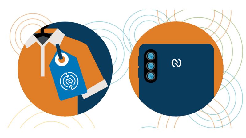
The NFC Forum have launched a new icon, called the 'Wayfinding Mark'. In their words, 'The Wayfinding Mark System will provide designers and product manufacturers flexibility while enhancing those brands that integrate contactless connections in their consumer journey.'
Seritag have long argued that the existing NFC Forum logo/icon hasn't quite been suitable for purpose. For many users, it too closely resembles the Nespresso coffee logo.
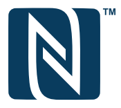
As a result, many users, including corporate brands, don't use the NFC Forum logo and use either their own design or one of the other common NFC logos.
In response to this (we would suggest), the NFC Forum has now added an additional NFC 'Wayfinding Mark'. To be clear, the NFC Forum are currently stating that the new mark will run alongside the existing NFC Forum N-Mark logo. It's not entirely obvious how that might work but it would appear that the new logos are designed to be more 'call to action' and therefore intended to be used where an action or interaction is likely to occur.
The primary variation of this new logo is the 'Directional' option :

The NFC Forum describe this as 'most helpful for tags and on occasionally used devices to overtly guide the user to the precise location of the NFC antenna for an optimal connectivity experience.' It's certainly a striking graphic and a good call to action. Initial reaction from many of our customers that have seen this was that it was a little complicated but we've done some test prints on smaller 30mm tags and we think it comes across quite well. It mimics the design of the antenna of an NFC tag, has an element of the very typical 'radio' waves and indicates clearly that there's a central action/response point.
Alongside this, there's also a new 'simplifed' version of the mark.

This is described as useful where users have a 'high degree of familiarity'.
Additionally to this, the NFC Forum have also released a couple of variants that they descibe as 'Instructional'. These include a graphic of a user holding a mobile phone over either the directional or simplified icons.

Seritag would certainly say that this is an interesting development and we'd also argue that the new logo is an improvement on the old one. Whether it will make things clearer for the consumer or simply further dilute the number of graphics and icons being used to identify NFC remains to be seen. We also aren't sure how the new icon will really sit alongside the existing NFC Forum icon in general use.
However, it's also a shame that the NFC Forum didn't issue a variant with the NFC letters as well. The directional variant does give better guidance to the user and over time, if brands start to use the logo, it will become more obvious. But the statistics and data over many years have made it quite obvious that in many cases consumers simply don't identify with any particular NFC icon and the use of the 'NFC' letters underneath any logo is still critical. It may, in time, not be required if a standard logo becomes the norm - but to get to that point the logo needs to build recognition.
In short, we like the logo. We think both variants have impact and we like the simplicity of the designs. It implies connection, it moves the existing NFC Forum N-Mark in the right direction. We do still strongly recommend that customers looking to implement the design on public facing items also include the use of the letters 'NFC' though.

A quick intro to NFC tags - what they are, how they are used and the different types of tags

Find the right product in our extensive, hand-picked selection of NFC tags.

Details of our NFC tag encoding services.

How to order ID / QR code printing on your NFC tags.

How you can order a UID scan of your NFC tags.


